Self-Branding Logo Creation
For one of my senior public relations courses at Auburn University, I had to take a style and design class. I have not used Adobe platforms since my freshman year of high school, which made me nervous yet eager to take this course. I was excited to get back into the world of design to strengthen my public relations skillset.
At the beginning of the course, I completed several Adobe tutorials, which jogged my memory of the platform. Adobe Creative Cloud provides many tutorials for their platforms to educate users on different design techniques. The tutorials would later assist me in our self-branding project, specifically when creating a personal brand logo. The tutorial that I found the most helpful for this project was “Adding Text To Your Designs.”
Designing a Self-Branding Logo
The point of creating a personal brand logo is to “create a professional image, establish credibility and differentiate yourself from others in your niche.”
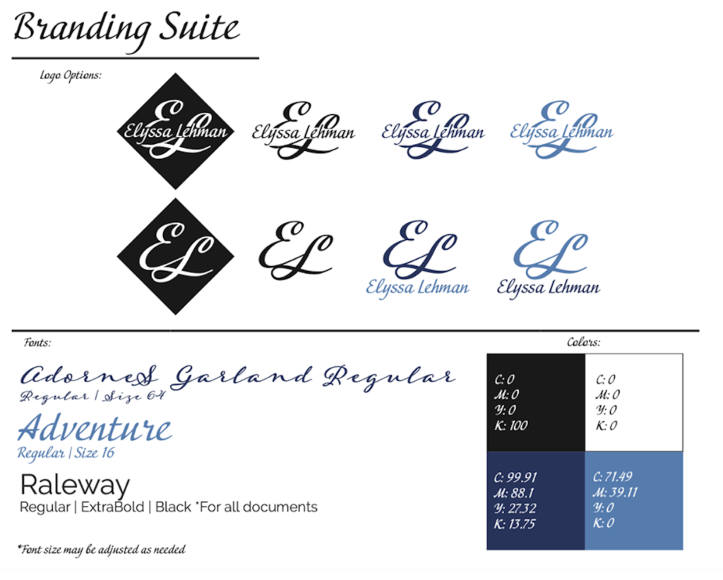
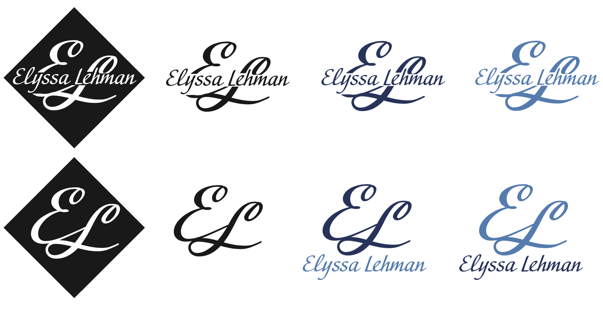
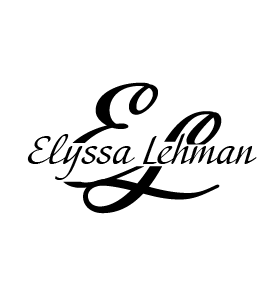
As a part of my personal branding project, I was required to create a logo from scratch to use to market myself as an upcoming public relations professional. I wanted my logo to reflect my personality, creativity and professionalism and wanted a sleek look with feelings of comfort and trust.
One of the most difficult parts was starting from scratch with total creative freedom. That gave me an opportunity to play around with Adobe Illustrator and find something that I felt confident in to accurately represent myself.
Choosing a Font and Manipulating Text
Since the project was creating a self-branding logo, I decided to include my name and my initials in the design. When handwriting my name, I always use a cursive styled “e,” so I figured that was a good place to start. Once I found a font that I liked (AdorneS Garland Regular) I used my knowledge from the Illustrator tutorial to turn my text into an object. Then I moved the letters into a formation I liked and erased the finials on top of the letters to make them smoother. Finials are tapered or curved ends on a letter. This would end up being one of my logo options.
Next, I needed to create a logo variation to make my logo versatile for different settings. This way my target audience can recognize me quicker by seeing my logo more often. After experimenting with multiple fonts, I found another one I liked (Adventure) that paired well with my original design. I typed out my full name in the new font over my first design, then erased a middle section from my initials to leave a space to see my name.
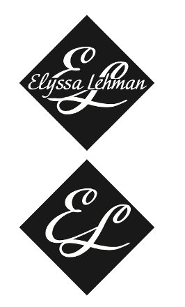
Additionally, I made one more logo variation with a black square behind the text and used white font to make the logo stand out on more professional documents.
The final step was to choose some colors to utilize in my logo. I picked two different shades of blue to allow for design variety. My choice in using blue was strategic in two ways: The first is that blue is my favorite color. The second is that blue symbolizes calmness, responsibility, trust, intelligence and more. These attributes resonate and match with my personality and how I represent myself. Color is an amazing strategy to convey different messages to your audience without explicitly saying them.
Putting it All Together
Creating a personal brand logo allowed me to further my design skills and create a branding suite that I can use on future projects to represent myself in the public relations industry. If you are looking to design your own personal brand logo or just want to learn more about Adobe Illustrator, I highly recommend taking on this project. It will get you familiar with Adobe principles and leave you with a tangible project to share.